22 May 2015
Visualizing latency variance with Grafana
Measuring ICMP latency is a core tool for monitoring your network performance and is a common method for discovering symptoms that can reveal many different problems. Smokeping is best tool I know of that can display latency variance nicely. Smokeping uses RRDtool as its underlying database, but RRDtool has big problems with scaling if you have a huge number of metrics. There is a number of new contenders in the time series database space and I wanted to investigate and learn more about them. For this project I chose to use Influxdb, which markets itself as a time series, metrics, and analytics database.
Grafana is a HTML5 dashboard tool which can gather metrics from different databases that enables you to select metrics visualize them.
So my goal is to see if I could come close to Smokeping's way of visualizing latency variance using "smoke" with Grafan's built in capabilities.
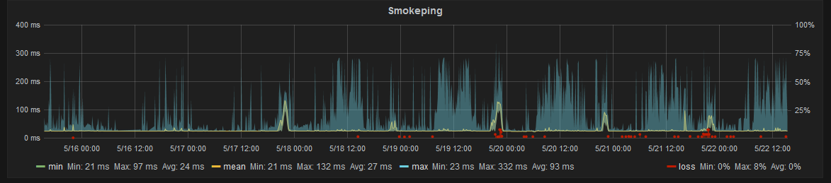
Example of Smokeping's graph from smokeping's site
In the spirit of learning (I'm very new to Go) I wrote a small program in Go that parses the output of fping and stores the results in Influxdb. Add hosts in the configuration.toml file and run it to start storing metrics in influxdb.
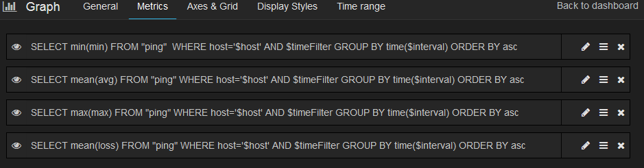
After I've gotten the metrics stored, I installed the development version of Grafana which has support for Influxdb 0.9. The whole trick to this thing is storing each output field from fping as separate series in influxdb. That means min, avg, max, and loss, and then selecting them as different series for grafana to graph. Let me show you:
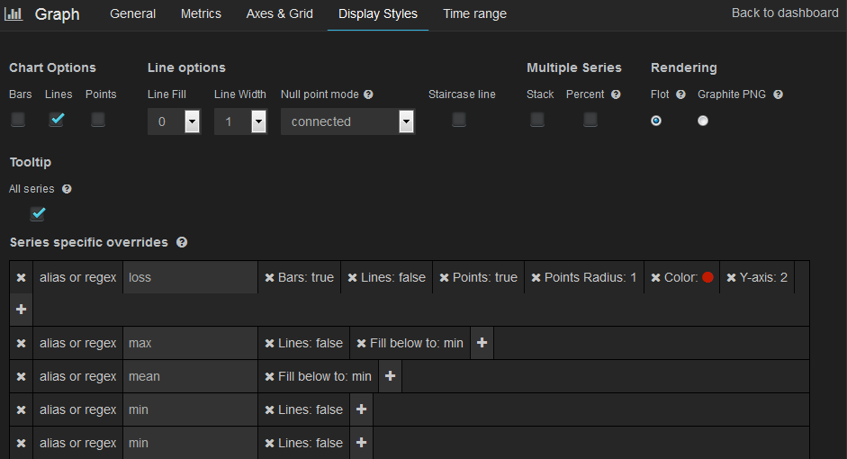
And after giving aliases to the different series we choose some different display styles for each. I will use fill below to get it to draw the area between max and mean, and mean and min. The loss series will be drawn as a bar chart in red to really display where there's been actual loss of packages. Also the min for that series gets set to 0 so it won't clutter the graph when there's no loss. Again, let me show you with a screenshot of the settings:
End result
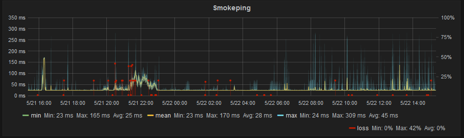
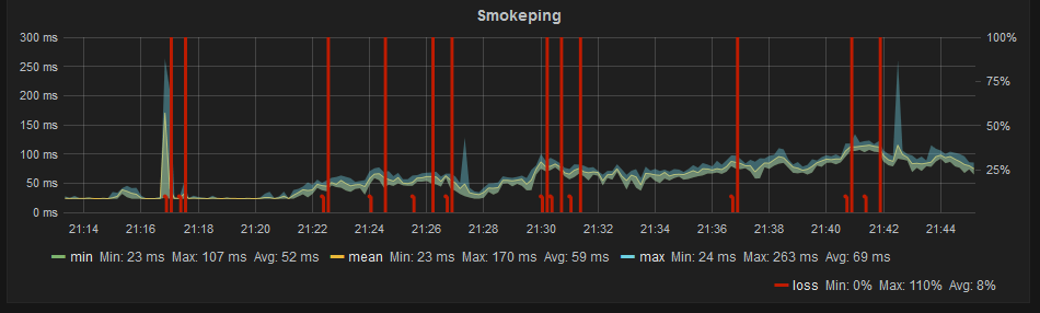
The end result is in my opinion beautiful graphs which gives a lot of useful information in a single chart:
Zoomed in:
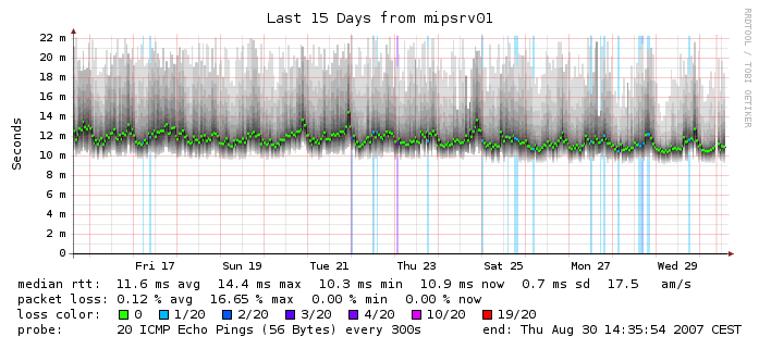
Zoomed out to a week